
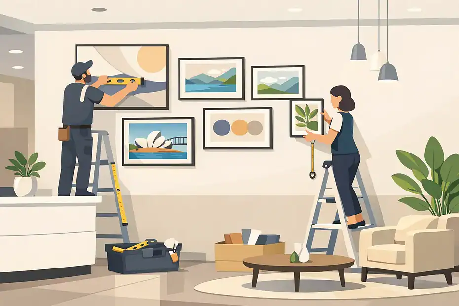
A blank reception wall says more than most businesses realize. It can make a space feel unfinished, forgettable, or slightly off before a client has even taken a seat. Good reception area wall art installation changes that fast. It gives the room a point of view, supports your brand, and makes the space feel considered rather than merely furnished.
This is one of those details that looks simple from a distance and gets much harder up close. The right piece in the wrong position can feel awkward. A strong layout installed poorly can make a polished office look careless. In a reception area, where people are waiting, noticing, and forming opinions, placement matters just as much as the artwork itself.
Why reception area wall art installation matters
Reception spaces do several jobs at once. They welcome guests, reassure clients, reflect the standards of the business, and often give staff a shared front-facing environment that sets the tone for the day. Art helps with all of that, but only when it fits the room properly.
A thoughtfully installed piece can soften a hard commercial interior, add warmth to minimal finishes, or create structure on a large wall that would otherwise feel empty. It can also reinforce what your business stands for. A legal office may want calm, restraint, and confidence. A creative studio might lean into bold color and energy. A medical or wellness setting usually benefits from artwork that feels grounded and easy to sit with.
That is why reception area wall art installation is not just about hanging something at eye level and hoping for the best. Scale, sightlines, lighting, furniture, and traffic flow all affect the final result.
Start with the wall, not the artwork
Most mistakes happen because people choose the art first and ask the wall to accommodate it later. In a reception area, it works better the other way around. Start by looking at the size of the wall, the ceiling height, nearby furniture, and where people enter the room.
If the main wall sits behind a front desk, the artwork needs to work with that desk rather than compete with it. If the wall is visible from the entrance, it becomes an immediate focal point and needs stronger balance. Large empty walls often need one oversized statement piece or a well-planned grouped arrangement. Small walls usually benefit from restraint. Trying to fill every inch rarely improves the space.
There is also a practical side. Commercial walls are not all the same. Drywall, masonry, concrete, and partition systems each require different fixings. Heavy framed pieces, mirrors, and layered installations need secure support, not guesswork. A reception area gets steady daily use, so stability is not optional.
Choosing art that fits the space
The best reception art is not always the most expensive or dramatic piece. It is the one that feels right for the room and the people using it. In many businesses, that means artwork that is visually strong without being distracting.
Abstract pieces work well because they bring color, movement, and polish without demanding too much attention. Photography can be effective too, especially when it ties into place, industry, or brand personality. Framed prints, canvases, dimensional wall objects, and curated multi-piece layouts can all work in a reception setting. What matters is proportion and presentation.
There is a trade-off here. Bold artwork creates impact, but if it overwhelms a small waiting area, it can make the room feel tense rather than stylish. Softer work can create comfort, but if it is too quiet for a large commercial wall, the whole space may still feel underdone. This is where an experienced installer with a visual eye adds real value. Technical fitting is only half the job. Knowing where a piece should sit, how high it should land, and how much breathing room it needs is what makes it look intentional.
Reception area wall art installation and placement basics
Height is the detail people get wrong most often. In commercial spaces, artwork is frequently hung too high, especially on large walls. The result is a disconnected look where the art floats above the room instead of belonging to it.
The right placement depends on what sits below the artwork and how the room is used. A piece above a reception desk should feel visually connected to the desk. A piece on a stand-alone feature wall should align with natural sightlines from the entrance and seating area. In grouped layouts, spacing should be consistent enough to feel organized but not so tight that each piece loses definition.
Lighting matters too. Glare from windows or overhead fixtures can flatten a great piece or make framed glass difficult to view. Before installation, it helps to check the wall at different times of day. Reception areas often have mixed lighting conditions, and a placement that looks perfect at noon may be reflective and distracting by late afternoon.
Then there is symmetry. Some reception spaces benefit from centered, formal placement because it communicates order and professionalism. Others look better with an offset or gallery-style arrangement that feels more relaxed. Neither approach is automatically better. It depends on the business, the architecture, and what the room needs.
When professional installation makes the biggest difference
Some wall art is straightforward. A lightweight frame on a simple drywall surface is one thing. A heavy mirror, a large framed print, a multi-panel canvas set, or a series of pieces that all need exact alignment is something else entirely.
In a reception area, there is little room for visible mistakes. Crooked lines, poor spacing, patch marks from failed attempts, and insecure fixings all stand out quickly. More importantly, they affect how the business is perceived. Visitors may not know why the room feels off, but they notice when the presentation lacks precision.
Professional installation helps avoid the common problems – incorrect anchors, poor measurements, uneven spacing, wall damage, and placements that looked fine in theory but not in the actual room. It also saves time for office managers and business owners who already have enough on their plate.
For businesses in Sydney that want the job done cleanly and accurately, a specialist service like HanGsy brings both secure installation and practical placement advice. That combination matters most when the artwork is valuable, oversized, or central to the look of the space.
Common reception wall art mistakes
The most common issue is choosing art that is too small. A tiny frame on a wide reception wall rarely looks refined. It usually looks temporary. The fix is either a larger piece or a grouped arrangement designed for the scale of the wall.
Another problem is poor spacing. Art hung too close to doors, screens, furniture, or corners can feel squeezed in. On the other hand, spacing pieces too far apart can make a collection feel scattered. Consistency creates calm, especially in a front-of-house area.
Businesses also sometimes treat reception art as an afterthought. They finish the furniture, flooring, and signage, then hang whatever artwork is available. The result is a space that feels assembled rather than designed. Even a modest art budget can look polished when placement is properly planned.
Finally, there is the safety issue. Heavy pieces need to be installed for the actual wall type and expected load, not just hung with whatever hardware is on hand. In a public-facing area, that is not a corner to cut.
How to get the look right the first time
It helps to think about the reception area as one composition instead of a collection of separate items. The desk, seating, wall finishes, signage, and artwork should support one another. If the room already has strong materials or branding, the artwork may need to be more restrained. If the space feels plain or overly functional, art can do more of the heavy lifting.
Mocking up placement before final installation is often worth it, especially for grouped works or feature walls. Even small adjustments in height and spacing can change the whole feel of the room. A professional installer can spot those differences quickly and make recommendations based on proportion, not guesswork.
The goal is not to fill a wall. It is to make the room feel finished, confident, and welcoming. When that happens, people notice it immediately, even if they never comment on the art itself.
A well-installed piece in the right place does quiet work every day. It supports your brand, improves the room, and gives visitors a better first impression before a single word is spoken.