
Walk into a newly finished workplace and you can tell right away when the walls were treated as an afterthought. A strong office fitout art installation example shows the opposite – art is planned as part of the space, not added at the end to fill blank walls. Done well, it supports the brand, improves how the office feels day to day, and gives clients a more polished first impression.
For most businesses, the goal is not to turn the office into a gallery. It is to create a workplace that feels considered, professional, and visually balanced. That means choosing the right pieces, placing them with purpose, and installing them properly so the result looks clean and stays secure.
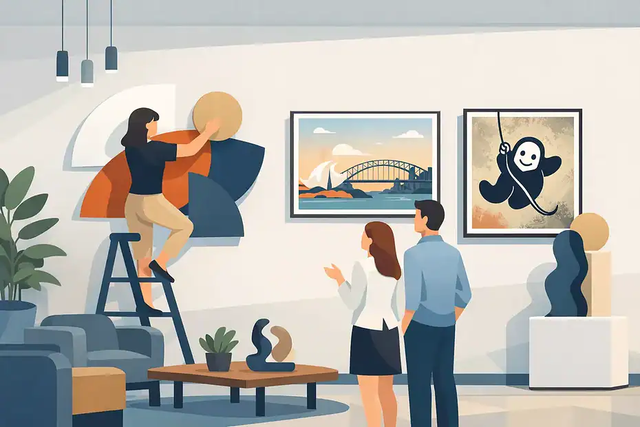
A practical office fitout art installation example
Picture a mid-sized professional services office with a reception area, two meeting rooms, an open-plan workstation zone, a hallway, and several private offices. The fitout is modern and restrained – neutral walls, black framing details, timber accents, and glass partitions. The team wants the space to feel confident and welcoming without looking cold.
In reception, one large framed artwork is installed behind the front desk as the hero piece. It is scaled to the wall rather than chosen simply because it looked good in a catalog. The frame finish matches the black details used elsewhere in the fitout, so the artwork feels integrated into the room. Instead of hanging it too high, the piece is centered to suit the sightline of standing visitors at the desk and seated guests in the waiting area.
Along the main hallway, a series of six framed prints is installed in a consistent line. Spacing is kept even, with the set treated as one visual composition rather than six separate jobs. This creates rhythm through a transitional space that might otherwise feel flat. The result is tidy and intentional, which matters in a corridor where small alignment issues become obvious fast.
In the larger meeting room, the business chooses one oversized canvas with subtle brand colors. This works better than multiple small works because the room already contains a table, screens, chairs, and cabling. Adding too many pieces would create visual noise. In the smaller meeting room, a pair of framed works is used instead, scaled to the shorter wall and installed to maintain symmetry behind the meeting table.
Private offices get simpler treatment. One or two framed pieces per room are enough, especially where storage, diplomas, or shelving already compete for attention. The open-plan area is handled carefully. Art is placed on perimeter walls and breakout spaces rather than scattered everywhere, so the environment feels elevated without becoming distracting.
That is a useful office fitout art installation example because it reflects how real workplaces function. Different zones need different levels of visual impact. Reception can carry a stronger statement. Hallways benefit from continuity. Meeting rooms need focus. Work areas need restraint.
What makes an office installation work
The difference between average and impressive office art usually comes down to planning. Businesses often spend heavily on furniture, flooring, and joinery, then rush the artwork in the final week. That is where scale mistakes, awkward spacing, and poor placement happen.
The first consideration is purpose. Some offices want art to reinforce a premium brand image. Others want to warm up a sterile space or make staff areas feel more human. A creative studio may be able to use bold, expressive pieces across large walls. A legal or financial office may get better results from quieter work with stronger structure and less visual clutter. Neither approach is automatically better. It depends on the business, the client experience, and how the team uses the space.
The next factor is scale. This is where many installations fall short. Small pieces on a large reception wall can look hesitant. Oversized art in a narrow room can overwhelm the space. The right size is not just about the artwork itself. It is about the relationship between the piece, the wall, nearby furniture, and the viewing distance.
Placement matters just as much. Good installation is not random centering. It considers eye level, room function, furniture position, traffic flow, and what sits on adjacent walls. In offices, glass partitions, lighting reflections, and sightlines through doorways all affect whether a piece feels right once installed.
Then there is the technical side. Commercial walls may be plasterboard, concrete, masonry, or a mix of surfaces within one fitout. Pieces may be heavy, glazed, oversized, or valuable. Secure fixing is not optional. It protects the work, the wall, and the people using the space.
Where offices usually get it wrong
One common mistake is treating art selection and installation as separate decisions. A business picks pieces first, then tries to make them fit later. A better process is to assess the walls early and choose art with those spaces in mind.
Another issue is inconsistent hanging height. In a home, slight variation can sometimes go unnoticed. In an office, especially with repeated framed works, inconsistency reads as careless. Hallways, boardrooms, and reception areas need disciplined alignment.
There is also a tendency to overfill walls. Blank space is not wasted space. In commercial interiors, breathing room often makes the artwork look more expensive and the fitout more refined. Trying to cover every wall can cheapen the result.
Businesses also underestimate installation complexity. Hanging one light frame is not the same as installing a multi-piece arrangement across a corridor, or mounting heavy framed art onto difficult wall surfaces. The more visible the space, the less room there is for trial and error.
Planning an office fitout art installation example for your own space
If you are organizing a fitout or refreshing an existing office, start by identifying the key visual moments. Usually that means reception, primary meeting rooms, hallways, and any client-facing offices. These areas carry the most weight because they shape first impressions and are seen most often.
From there, think in zones rather than isolated walls. A reception statement piece might set the tone, while a hallway series creates continuity and meeting rooms use quieter supporting works. This approach produces a stronger overall result than choosing each wall independently.
It also helps to decide early whether the art should be branded, neutral, local, abstract, photographic, or a mix. Some businesses lean too hard into obvious brand messaging and end up with work that feels forced. Others avoid any brand connection at all and miss a chance to make the office feel distinct. The best middle ground is often subtle use of brand colors, themes, or materials without turning every piece into marketing.
Installation timing matters too. The cleanest result usually comes after major construction is complete but before the office is fully occupied. That allows for accurate measurement, safe access, and minimal disruption. It also avoids the awkward situation where teams are trying to work around ladders, dust, or relocated furniture.
Why professional installation changes the result
Office art has to do two jobs at once. It has to look right and it has to stay right. That is why professional installation matters more than many businesses expect.
A specialist installer brings more than tools. They bring judgment on spacing, height, grouping, wall type, fixing method, and visual balance. That becomes especially valuable when multiple pieces must align across a large area or when heavy items need to be mounted securely without damaging finished walls.
For business owners and office managers, there is also a practical benefit. The process moves faster, the risk of wall damage is lower, and the final presentation is more polished. When the artwork is valuable or highly visible, that peace of mind is worth a lot.
For companies that care about presentation, working with dedicated hanging specialists such as HanGsy can make the difference between art that merely fills a wall and art that completes the fitout.
Office fitout art installation example by space type
Not every office needs the same formula. A corporate reception may suit a single large statement piece. A medical or wellness practice may benefit from softer, calming works with more open spacing. A co-working environment might use bolder groupings and more personality in shared zones.
Even within one office, the approach should shift. Client-facing spaces generally deserve the strongest visual attention. Staff-only spaces can be lighter and more functional. Break rooms are a good place for warmth and character, while boardrooms usually benefit from restraint.
That is why the best office fitout art installation example is never just about the artwork itself. It is about matching each installation decision to the function of the room.
When art is selected thoughtfully, scaled correctly, and installed with precision, it stops feeling like decoration and starts feeling like part of the architecture. That is the point worth aiming for if you want the office to look finished, not just furnished.