
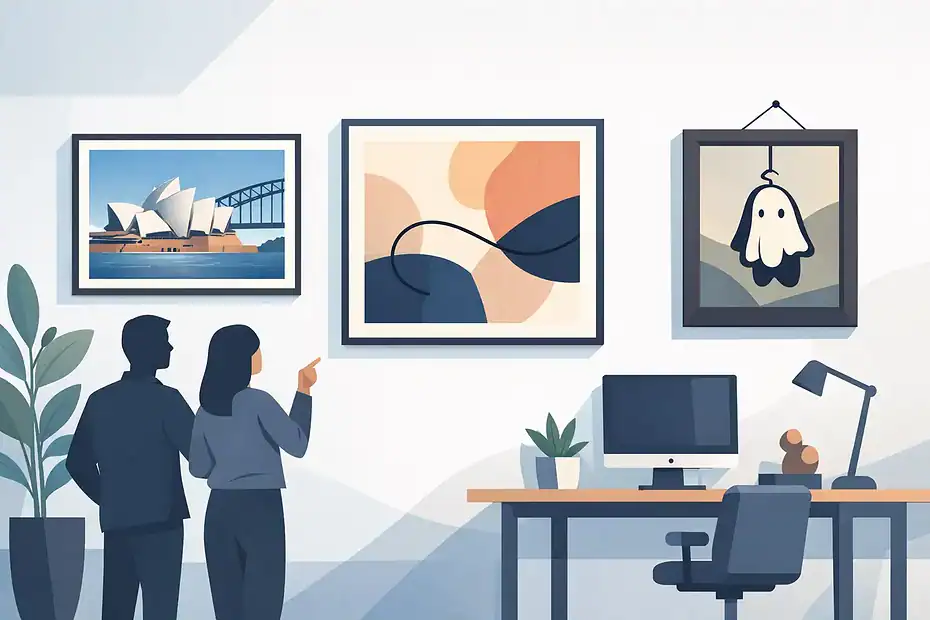
A great piece of office art can make a room feel sharper, calmer, and more intentional in seconds. But the best office art placement is rarely about filling an empty wall. It is about where people sit, what they see first, how the room flows, and whether the piece feels confidently placed rather than randomly hung.
In offices, placement matters more than people expect. Art that is too high can feel disconnected. Art that is too small can make a large wall look unfinished. A beautiful framed print hung off-center behind a desk can quietly throw off the whole room. These details affect how polished a workspace feels, whether it is a private office, reception area, meeting room, or shared commercial space.
What best office art placement really depends on
There is no single rule that works for every office. The best office art placement depends on three things first – wall size, furniture layout, and viewing distance.
If a wall sits behind a desk, the art needs to relate to the desk width and leave enough breathing room around it. If the wall is in a hallway or waiting area, the main concern is how the piece reads as someone walks toward it. In a conference room, placement needs to work both from the seated position and from the doorway.
That is why copying what looks good in a home or hotel does not always translate well in a workplace. Offices have more functional constraints. There are chairs, monitors, credenzas, glass walls, lighting glare, and traffic patterns to account for. Good placement respects all of them without making the room feel overdesigned.
Start with the natural sightline
The strongest place for office art is usually where the eye lands naturally. That may be the wall behind a reception desk, the main wall opposite the door, or the area above a credenza in a private office.
When people enter a room, they do not study every wall equally. They notice one or two focal points first. Art works best when it supports those focal points instead of competing with them. In practical terms, that means placing your most important piece where it will be seen clearly and straight on, not tucked into a side wall simply because there is open space.
Height is part of this. In most office settings, the center of the artwork should sit close to average eye level. That keeps the piece connected to the people using the room. If you hang art too high, especially in rooms with standard ceilings, the wall starts to feel split in half. The artwork floats and the furniture below feels unrelated.
There are exceptions. If you are placing art above tall furniture or in a lobby with high ceilings, the height may need adjustment. But even then, visual connection matters more than chasing dramatic height.
Match the art to the furniture below it
One of the most common office mistakes is ignoring the relationship between wall art and the furniture underneath. If you are hanging a piece above a desk, sofa, console, or storage cabinet, the art should feel anchored to that object.
As a general rule, the artwork or grouped arrangement should span a meaningful portion of the furniture width. Too narrow, and it looks lost. Too wide, and it starts to feel unstable. The gap between the top of the furniture and the bottom of the frame matters too. Leave enough room so the art can breathe, but not so much that it feels detached.
This is especially important in executive offices and waiting areas, where furniture tends to define the room. A well-scaled piece above a credenza can make the entire space feel organized. A poorly sized piece can make even expensive furnishings look temporary.
Best office art placement for different rooms
Reception and waiting areas
Reception art sets the tone before anyone says a word. The best placement is usually on the main wall visible from the entry, or behind the reception desk if the background is clean and uncluttered.
In waiting areas, art should create calm and structure, not visual noise. One larger piece often works better than several small ones unless the gallery arrangement is carefully planned. Guests should be able to take in the artwork easily while seated, without needing to crane their necks.
Private offices
In private offices, placement depends on whether the art is intended for the person working there, for visitors, or both. Behind the desk often works well because it creates a strong backdrop for meetings and video calls. Side walls can also be effective if they are visible from the main seating area.
Avoid placing reflective framed pieces directly opposite harsh window light. What looks right on paper can become unreadable once glare hits the glass.
Conference rooms
Conference room art should support the space without distracting from it. The best office art placement here is often centered on the longest uninterrupted wall or positioned so it is visible from the room entry.
If a screen or whiteboard dominates one wall, use the secondary wall for artwork. Keep the scale strong enough to hold the space, especially in larger rooms where small pieces tend to disappear.
Hallways and transitional spaces
Hallways are ideal for consistent, repeated placement. This could be a series of evenly spaced pieces, aligned at the same center height. Consistency matters more than drama here. If spacing shifts from one piece to the next, the whole corridor can feel unsettled.
Single statement piece or grouped arrangement?
Both can work. It depends on the wall and the purpose of the room.
A single large piece creates clarity. It is often the safest choice for reception spaces, boardrooms, and offices where you want a clean, confident look. It is also easier to scale properly on larger walls.
A grouped arrangement can add personality and movement, but it demands more planning. Frames need a consistent relationship. Spacing has to be deliberate. The overall shape of the arrangement should feel intentional before the first hook goes into the wall.
This is where people often underestimate the installation side. A gallery wall that is one inch off in multiple places will never feel quite right, even if the artwork itself is excellent.
Don’t ignore wall type, weight, and permanence
Placement is not only visual. It is structural.
Office walls vary widely. You may be dealing with drywall, masonry, plaster, glass-adjacent surfaces, or partition walls with limited support. Heavy framed art, mirrors, and oversized canvases need the right hardware and secure fixing points. The best-looking placement on paper is the wrong placement if the wall cannot safely support the piece there.
There is also the question of permanence. In leased offices, some businesses want minimal wall damage and flexibility for future layout changes. In owner-occupied spaces, there is often more freedom to create stronger focal placements with heavier pieces or larger groupings. Neither approach is wrong. It just changes how the installation should be planned.
Common placement mistakes that make offices look off
Most office art problems are not dramatic. They are subtle, which is why they are easy to miss and hard to fix once installed.
The first is hanging art too high. The second is choosing pieces that are too small for the wall. The third is poor centering – either centering to the wall when the furniture should have been the reference point, or centering to furniture that is itself off-axis in the room.
Another frequent issue is uneven spacing in grouped layouts. People tend to eyeball gaps, and that rarely produces a polished result. Glare is another one. So is crowding art too close to doors, corners, shelving, or monitors.
None of these mistakes mean the art is wrong. Usually, the placement is.
Why professional placement makes a difference
Office art is one of those details that looks simple until accuracy matters. Getting placement right means balancing proportions, sightlines, wall conditions, security, and clean installation. That is why many businesses prefer a specialist rather than treating it like a basic handyman job.
A qualified installer brings two things that matter equally – technical precision and visual judgment. The first keeps the piece secure and the wall protected. The second makes sure the artwork actually improves the room. For offices with valuable framed works, heavy mirrors, or multiple pieces that need exact alignment, that combination saves time and avoids expensive do-overs.
For businesses that want a polished result without trial and error, working with a specialist service like HanGsy can make the process much more straightforward, especially when presentation is part of the brand experience.
The right office art should feel like it belongs exactly where it is. When placement is handled well, people may not comment on the measurements or spacing. They just notice that the room feels professional, balanced, and ready for business.